hc_app<-read.table("n:/misc/healthcareapproval.txt", header = T, sep = "\t")
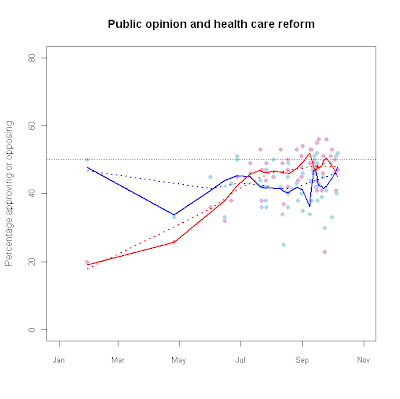
attach(hc_app) hc_fit.o1<-lowess(Oppose~as.Date(Dates),f=0.25)
hc_fit.f1<-lowess(Favor~as.Date(Dates),f=0.25)
hc_fit.o2<-lowess(Oppose~as.Date(Dates),f=0.75)
hc_fit.f2<-lowess(Favor~as.Date(Dates),f=0.75)
plot(as.Date(Dates),Oppose,
main="Public opinion and health care reform",
ylim=c(0,80),pch=16,
xlim=c(as.Date("2009-01-01"),as.Date("2009-11-01")),
cex.axis=.85, col="#E6ADD8",
xlab="",ylab="Percentage approving or opposing") points(as.Date(Dates),
Favor,pch=16,col="#ADD8E6")
lines(hc_fit.f1,col="blue",lwd=2)
lines(hc_fit.o1,col="red",lwd=2)
lines(hc_fit.f2,col="blue",lwd=2,lty=3)
lines(hc_fit.o2,col="red",lwd=2,lty=3)
abline(h=50,lwd=.5,lty=3,col="#555555")
fy<-c(1990:2019)
deficit.1<-c(-3.9, -4.5, -4.7, -3.9, -2.9, -2.2, -1.4, -0.3, 0.8, 1.4, 2.4, 1.3, -1.5, -3.5, -3.6, -2.6, -1.9, -1.2, -3.2, -11.2, -9.6, NA,NA, NA, NA, NA, NA, NA, NA, NA)
projected<-c(NA, NA, NA, NA, NA, NA, NA, NA, NA, NA, NA, NA, NA, NA, NA, NA, NA, NA, NA, NA, -9.6, -6.1, -3.7, -3.2, -3.2, -3.1, -3.3, -3.2, -3.1, -3.4)
png("c:/data/deficit_color.png",height=480,width=480)
plot(deficit.1~fy,ylim=c(-12,5),type="n",lwd=2,col="red",
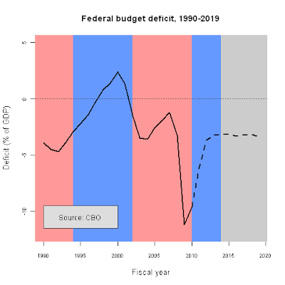
main="Federal budget deficit, 1990-2019",
cex.lab=1.1,cex.axis=.75,
xlab="Fiscal year",ylab="Deficit (% of GDP)")
rect(1988,-15,1994,6,col="#FF9999",border=NA)
rect(1994,-15,2002,6,col="#6699FF",border=NA)
rect(2002,-15,2010,6,col="#FF9999",border=NA)
rect(2010,-15,2014,6,col="#6699FF",border=NA)
rect(2014,-15,2021,6,col="#CCCCCC",border=NA)
abline(h=0,lwd=.5,lty=3,col="#555555")
lines(fy,deficit.1,lwd=2.5)
lines(fy,projected,lwd=2.5,lty=2)
rect(1990,-11.5,2000,-9.5,col="#dddddd",border="#555555")
text(1995,-10.5,"Source: CBO")
graphics.off()
It's pretty easy!
plot (c(1968,2010),c(0,10),type="n", # sets the x and y axes scales
xlab="Year",ylab="Expenditures/GDP (%)") # adds titles to the axes
lines(year,defense,col="red",lwd=2.5) # adds a line for defense expenditures
lines(year,health,col="blue",lwd=2.5) # adds a line for health expenditures
legend(2000,9.5, # places a legend at the appropriate place c("Health","Defense"), # puts text in the legend
lty=c(1,1), # gives the legend appropriate symbols (lines)
lwd=c(2.5,2.5),col=c("blue","red")) # gives the legend lines the correct color and width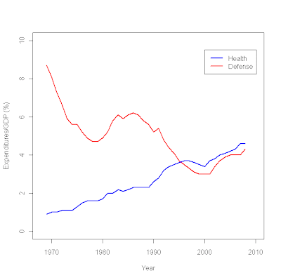
miss <- read.table ("/data/missing.txt", header = T, sep = "\t")
attach miss result1 <- glm(a~b, family=binomial(logit))
summary(result1)
Call: glm(formula = a ~ b, family = binomial(logit))
Deviance Residuals:
Min 1Q Median 3Q Max
-1.8864 -1.2036 0.7397 0.9425 1.4385
Coefficients:
Estimate Std. Error z value Pr(>|z|)
(Intercept) -5.96130 1.40609 -4.240 2.24e-05 ***
b 0.10950 0.02404 4.555 5.24e-06 ***
---
Signif. codes: 0 ‘***’ 0.001 ‘**’ 0.01 ‘*’ 0.05 ‘.’ 0.1 ‘ ’ 1
(Dispersion parameter for binomial family taken to be 1)
Null deviance: 279.97 on 203 degrees of freedom
Residual deviance: 236.37 on 202 degrees of freedom
(3 observations deleted due to missingness)
AIC: 240.37
Number of Fisher Scoring iterations: 5
detach (miss)
attach (miss2)
result2 <- glm(a~b, family=binomial(logit)) summary(result2) Call: glm(formula = a ~ b, family = binomial(logit)) Deviance Residuals: Min 1Q Median 3Q Max -1.884 -1.198 0.742 0.936 1.446 Coefficients: Estimate Std. Error z value Pr(>|z|)
(Intercept) -6.0059 1.4162 -4.241 2.23e-05 ***
b 0.1101 0.0242 4.549 5.39e-06 ***
---
Signif. codes: 0 ‘***’ 0.001 ‘**’ 0.01 ‘*’ 0.05 ‘.’ 0.1 ‘ ’ 1
(Dispersion parameter for binomial family taken to be 1)
Null deviance: 278.81 on 202 degrees of freedom
Residual deviance: 235.14 on 201 degrees of freedom
AIC: 239.14
Number of Fisher Scoring iterations: 5
plot(b, fitted(result1))
plot(b, fitted(result1), type="n")
curve(invlogit (coef(result1)[1]+coef(result1)[2]*x), add=TRUE)
This plot:
was created using the following R code:
plot (q9e~q8, type = "n",
xlim = c(1,13), ylim = c(1,13),
cex.lab=1.25,cex.axis=0.75,
col.lab = "#333333",
xlab = "Obama job grade",
ylab = "Congressional job grade",
xaxt ="n", yaxt="n",
main="Obama and Congressional 100 day job grades")
abline (or,lwd=2,col="red")
abline (od,lwd=2,col="blue")
axis(1,at=c(1,2,3,4,5,6,7,8,9,10,11,12,13),
lab=c("A+","A","A-","B+","B","B-","C+","C","C-","D+","D","D-","F"),
col.lab="#333333", col.axis="#333333", tck=-0.02, cex.axis=0.75)
axis(2,at=c(1,2,3,4,5,6,7,8,9,10,11,12,13),
lab=c("A+","A","A-","B+","B","B-","C+","C","C-","D+","D","D-","F"),
col.lab="#333333", col.axis="#333333", tck=-0.02, cex.axis=0.75)
text (5,6, "Democrats",col="blue")
text (4,9.5, "Republicans",col="red")
text(3,1,"Source: CNN/ORC Poll, April 2009",col="#777777",cex=0.75)
I've been getting a lot of help from this book:
While written for S-Plus, nearly everything in it is applicable with R.
cex.lab=1.25 and cex.axis=0.75 make the axis labels 1.25 times larger than normal, and the axis value labels 0.75 times normal size. The col.lab = "#777777" makes use of R's ability to accept hexidecimal color specifications, such as those used by web designers. It's a very useful function.
I specified that the x-axis label say nothing, while the y-axis label be "Obama job approval (%)". xaxt="n", yaxt="n" tell R not to plot either the x or y axes.
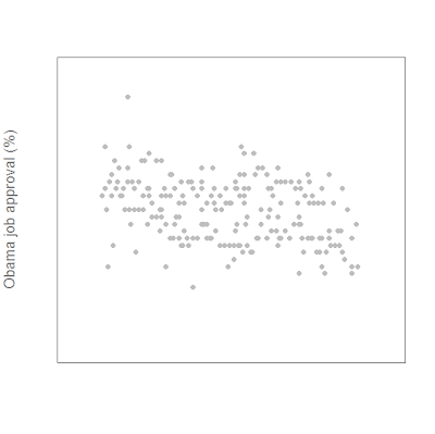
plot (app~daten, ylim=c(40,80), xlim=c(-3,210), pch=16, col="gray", cex.lab=1.25,cex.axis=0.75, col.lab = "#777777", xlab="",ylab="Obama job approval (%)", xaxt="n", yaxt="n")
This yields a very sparse-looking scatterplot:
Next we add the axes:
axis(1,at=c(-3,28,56,87,117,148,178,209),lab=c("Jan 09","Feb 09","Mar 09","Apr 09","May 09","Jun 09","Jul 09", "Aug 09"),
col.lab="#777777", col.axis="#777777", tck=-0.02, cex.axis=0.75)
axis(2, at=c(40,50,60,70,80),
col.axis="#777777",
las=2, tck=-0.02,
cex.axis=0.75)
Then we add our LOWESS fit lines:
lines(lfit1, col="red", lwd=3)
lines(lfit2, col="blue", lwd=3)
and we're done!
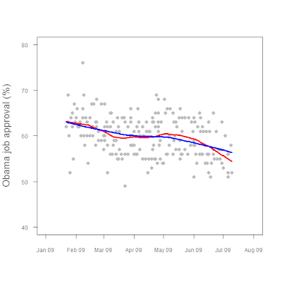
Figure1. President Obama job approval, Jan 2009 - present.

There's actually some pretty fancy stuff going on there, as the following code shows.
polls <- read.table("/data/polls.txt", header=TRUE, sep = "\t") attach (polls)
lfit1 <- lowess(app~daten, f=0.25)
lfit2 <- lowess(app~daten, f=0.75)
plot (app~daten, ylim=c(40,80), xlim=c(-3,210),
pch=16, col="gray",
cex.lab=1.25,cex.axis=0.75,
col.lab = "#777777",
xlab="",ylab="Obama job approval (%)", xaxt="n", yaxt="n")
axis(1,at=c(-3,28,56,87,117,148,178,209),
lab=c("Jan 09","Feb 09","Mar 09","Apr 09","May 09","Jun 09","Jul 09", "Aug 09"),
col.lab="#777777", col.axis="#777777", tck=-0.02, cex.axis=0.75)
axis(2, at=c(40,50,60,70,80),
col.axis="#777777",
las=2, tck=-0.02,
cex.axis=0.75)
lines(lfit1, col="red", lwd=3)
lines(lfit2, col="blue", lwd=3)
I'm back from vacation, so I'll post something substantive later today.
gdp <- read.table("c:/data/GDPC96.txt", header = TRUE)
attach(gdp)
as.Date(date)
plot(gdp~date, data=gdp,pch=16,xlab="",ylab="GDP (2000 dollars)")
Busy day today, so I'll just post this:
plot(bush04 ~ cons_hr, type = "n",
xlab="Mean ACU rating",
ylab="2004 Bush vote",
xlim=c(0,100),
ylim=c(0,100),
cex.lab=1.25,cex.axis=0.75,
col.axis = "#777777",
col.lab = "#777777")
text(y=bush04,x=cons_hr, labels=stateid,cex=0.75)
abline(lm2, lty=2, col="red")
axis(side = 2, at = seq(0,100,by=5), cex=0.75)
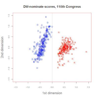
Let's look at some data on the U.S. Congress. Keith Poole has developed a two-dimensional procedure that places members of Congress at specific points based on roll call votes. What we'll do now is compare Democrats and Republicans in the 110th Congress.
First, we load the data into R.
voteview <- read.csv ("C:/Data/HouseSmall.csv", header = TRUE) attach (voteview)
dems110 <- subset(voteview, party == 100 & cong == 110)
reps110 <- subset(voteview, party == 200 & cong == 110)
Now let's create a graph to compare them.
plot (c (-1.5, 1.5), c(-1.5, 1.5), type = 'n',
xlab = "1st dimension",
ylab = "2nd dimension",
col.axis = "#777777",
col.lab = "#777777",
cex.axis = 0.75,
cex.lab = 1.25,
main = "DW-nominate scores, 110th Congress",
col.main = "#444444")
abline (v = 0, col = "#cccccc")
points (dwnom2 ~ dwnom1, data = dems110, pch = "D", col = "blue", cex = 0.75)
points (dwnom2 ~ dwnom1, data = reps110, pch = "R", col = "red", cex = 0.75)
model1 <- lm (publicedexp~hincome)
summary (model1)
Call:
lm(formula = publicedexp ~ hincome)
Residuals:
Min 1Q Median 3Q Max
-397.50 -127.43 -8.69 120.96 431.85
Coefficients:
Estimate Std. Error t value Pr(>|t|)
(Intercept) 2.516e+02 1.735e+02 1.450 0.153
hincome 2.346e-02 3.869e-03 6.063 1.87e-07 ***
---
Signif. codes: 0 ‘***’ 0.001 ‘**’ 0.01 ‘*’ 0.05 ‘.’ 0.1 ‘ ’ 1
Residual standard error: 198.8 on 49 degrees of freedom
Multiple R-squared: 0.4287, Adjusted R-squared: 0.417
F-statistic: 36.76 on 1 and 49 DF, p-value: 1.87e-07
First, I import the data into R with the following command:
states <- read.table("C:/Data/states.txt", header=TRUE, sep = "\t")
Next I 'attach' the data frame with the following command:
attach (states)
OK, now that I've got my data into R, what can I do with it?
First, I'll run some correlations and see what's going on.
cor (read2children, publicedexp)
[1] 0.4211508
cor (hincome, publicedexp)
[1] 0.6547179
cor (read2children, hincome)
[1] 0.4094883
Let's look at the data a different way, by using scatterplots to see the relationships.
plot is the R command for, well, plotting. It's very powerful and you can do lots of things with it. First I'll do a very simple scatterplot of education expenditures and children read to.
plot (publicedexp, read2children)
I'll be using this blog to keep track of my progress and to record what I'm doing along the way.

