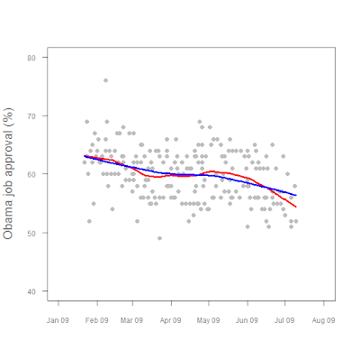
Working some more with time series data. Here we have a graph of Obama job approval numbers, with two LOWESS-fit lines added for trending:
Figure1. President Obama job approval, Jan 2009 - present.

There's actually some pretty fancy stuff going on there, as the following code shows.
polls <- read.table("/data/polls.txt", header=TRUE, sep = "\t") attach (polls)
lfit1 <- lowess(app~daten, f=0.25)
lfit2 <- lowess(app~daten, f=0.75)
plot (app~daten, ylim=c(40,80), xlim=c(-3,210),
pch=16, col="gray",
cex.lab=1.25,cex.axis=0.75,
col.lab = "#777777",
xlab="",ylab="Obama job approval (%)", xaxt="n", yaxt="n")
axis(1,at=c(-3,28,56,87,117,148,178,209),
lab=c("Jan 09","Feb 09","Mar 09","Apr 09","May 09","Jun 09","Jul 09", "Aug 09"),
col.lab="#777777", col.axis="#777777", tck=-0.02, cex.axis=0.75)
axis(2, at=c(40,50,60,70,80),
col.axis="#777777",
las=2, tck=-0.02,
cex.axis=0.75)
lines(lfit1, col="red", lwd=3)
lines(lfit2, col="blue", lwd=3)
Post a Comment 0 comments: