It's pretty easy!
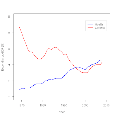
plot (c(1968,2010),c(0,10),type="n", # sets the x and y axes scales
xlab="Year",ylab="Expenditures/GDP (%)") # adds titles to the axes
lines(year,defense,col="red",lwd=2.5) # adds a line for defense expenditures
lines(year,health,col="blue",lwd=2.5) # adds a line for health expenditures
legend(2000,9.5, # places a legend at the appropriate place c("Health","Defense"), # puts text in the legend
lty=c(1,1), # gives the legend appropriate symbols (lines)
lwd=c(2.5,2.5),col=c("blue","red")) # gives the legend lines the correct color and width
miss <- read.table ("/data/missing.txt", header = T, sep = "\t")
attach miss result1 <- glm(a~b, family=binomial(logit))
summary(result1)
Call: glm(formula = a ~ b, family = binomial(logit))
Deviance Residuals:
Min 1Q Median 3Q Max
-1.8864 -1.2036 0.7397 0.9425 1.4385
Coefficients:
Estimate Std. Error z value Pr(>|z|)
(Intercept) -5.96130 1.40609 -4.240 2.24e-05 ***
b 0.10950 0.02404 4.555 5.24e-06 ***
---
Signif. codes: 0 ‘***’ 0.001 ‘**’ 0.01 ‘*’ 0.05 ‘.’ 0.1 ‘ ’ 1
(Dispersion parameter for binomial family taken to be 1)
Null deviance: 279.97 on 203 degrees of freedom
Residual deviance: 236.37 on 202 degrees of freedom
(3 observations deleted due to missingness)
AIC: 240.37
Number of Fisher Scoring iterations: 5
detach (miss)
attach (miss2)
result2 <- glm(a~b, family=binomial(logit)) summary(result2) Call: glm(formula = a ~ b, family = binomial(logit)) Deviance Residuals: Min 1Q Median 3Q Max -1.884 -1.198 0.742 0.936 1.446 Coefficients: Estimate Std. Error z value Pr(>|z|)
(Intercept) -6.0059 1.4162 -4.241 2.23e-05 ***
b 0.1101 0.0242 4.549 5.39e-06 ***
---
Signif. codes: 0 ‘***’ 0.001 ‘**’ 0.01 ‘*’ 0.05 ‘.’ 0.1 ‘ ’ 1
(Dispersion parameter for binomial family taken to be 1)
Null deviance: 278.81 on 202 degrees of freedom
Residual deviance: 235.14 on 201 degrees of freedom
AIC: 239.14
Number of Fisher Scoring iterations: 5
plot(b, fitted(result1))
plot(b, fitted(result1), type="n")
curve(invlogit (coef(result1)[1]+coef(result1)[2]*x), add=TRUE)
This plot:
was created using the following R code:
plot (q9e~q8, type = "n",
xlim = c(1,13), ylim = c(1,13),
cex.lab=1.25,cex.axis=0.75,
col.lab = "#333333",
xlab = "Obama job grade",
ylab = "Congressional job grade",
xaxt ="n", yaxt="n",
main="Obama and Congressional 100 day job grades")
abline (or,lwd=2,col="red")
abline (od,lwd=2,col="blue")
axis(1,at=c(1,2,3,4,5,6,7,8,9,10,11,12,13),
lab=c("A+","A","A-","B+","B","B-","C+","C","C-","D+","D","D-","F"),
col.lab="#333333", col.axis="#333333", tck=-0.02, cex.axis=0.75)
axis(2,at=c(1,2,3,4,5,6,7,8,9,10,11,12,13),
lab=c("A+","A","A-","B+","B","B-","C+","C","C-","D+","D","D-","F"),
col.lab="#333333", col.axis="#333333", tck=-0.02, cex.axis=0.75)
text (5,6, "Democrats",col="blue")
text (4,9.5, "Republicans",col="red")
text(3,1,"Source: CNN/ORC Poll, April 2009",col="#777777",cex=0.75)
I've been getting a lot of help from this book:
While written for S-Plus, nearly everything in it is applicable with R.
cex.lab=1.25 and cex.axis=0.75 make the axis labels 1.25 times larger than normal, and the axis value labels 0.75 times normal size. The col.lab = "#777777" makes use of R's ability to accept hexidecimal color specifications, such as those used by web designers. It's a very useful function.
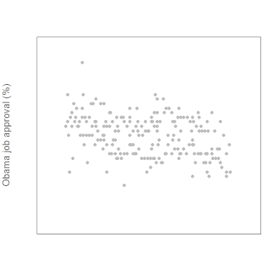
I specified that the x-axis label say nothing, while the y-axis label be "Obama job approval (%)". xaxt="n", yaxt="n" tell R not to plot either the x or y axes.
plot (app~daten, ylim=c(40,80), xlim=c(-3,210), pch=16, col="gray", cex.lab=1.25,cex.axis=0.75, col.lab = "#777777", xlab="",ylab="Obama job approval (%)", xaxt="n", yaxt="n")
This yields a very sparse-looking scatterplot:

Next we add the axes:
axis(1,at=c(-3,28,56,87,117,148,178,209),lab=c("Jan 09","Feb 09","Mar 09","Apr 09","May 09","Jun 09","Jul 09", "Aug 09"),
col.lab="#777777", col.axis="#777777", tck=-0.02, cex.axis=0.75)
axis(2, at=c(40,50,60,70,80),
col.axis="#777777",
las=2, tck=-0.02,
cex.axis=0.75)
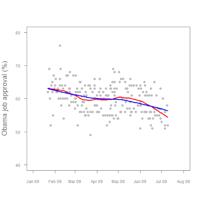
Then we add our LOWESS fit lines:
lines(lfit1, col="red", lwd=3)
lines(lfit2, col="blue", lwd=3)
and we're done!

Figure1. President Obama job approval, Jan 2009 - present.

There's actually some pretty fancy stuff going on there, as the following code shows.
polls <- read.table("/data/polls.txt", header=TRUE, sep = "\t") attach (polls)
lfit1 <- lowess(app~daten, f=0.25)
lfit2 <- lowess(app~daten, f=0.75)
plot (app~daten, ylim=c(40,80), xlim=c(-3,210),
pch=16, col="gray",
cex.lab=1.25,cex.axis=0.75,
col.lab = "#777777",
xlab="",ylab="Obama job approval (%)", xaxt="n", yaxt="n")
axis(1,at=c(-3,28,56,87,117,148,178,209),
lab=c("Jan 09","Feb 09","Mar 09","Apr 09","May 09","Jun 09","Jul 09", "Aug 09"),
col.lab="#777777", col.axis="#777777", tck=-0.02, cex.axis=0.75)
axis(2, at=c(40,50,60,70,80),
col.axis="#777777",
las=2, tck=-0.02,
cex.axis=0.75)
lines(lfit1, col="red", lwd=3)
lines(lfit2, col="blue", lwd=3)
I'm back from vacation, so I'll post something substantive later today.