OK, let's say you want to create a plot and you need an easy way to specify where along the scale your tick marks and labels land, as opposed to having R just decide itself. An easy way to do that is to create a vector and assign the axis characteristics tio the vector (or vice versa, depending on how you look at it.)
First, let's create some data to plot:
a <- c(12,4,56,4,65,7,19,25,40,12)
b <- c(42,16,36,4,25,47,29,75,10,22)
Now we can plot a against b and we get:
plot (a, b)
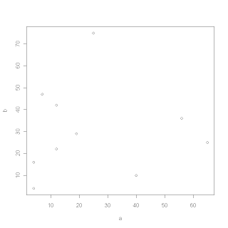
OK, that's an ugly plot but it serves our purpose as an example. Notice that both axes have tick marks every 10 points. Suppose we wanted to specify that they were closer (or further apart.) Let's say we wanted them to be every five points away. (We probably don't want that, but we'll deal with that in a minute.)
First, let's create a vector that covers the range of both axes, and is in intervals of five. We'll name that vector, 'd':
d <- seq(0,70,by=5)
Now, let's re-create our plot, but use the vector we created as the 'rule' by which the axes ticks and labels are placed:
plot (a, b, xaxt = 'n', yaxt = 'n')
axis (1, at = d)
axis (2, a t= d)
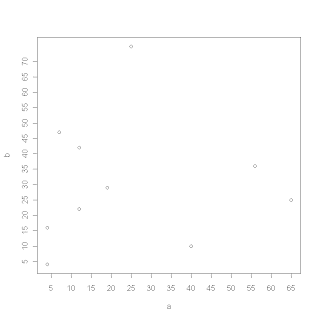
OK, that looks kinda crappy because the axes are too cluttered. What if we decided we wanted the ticks every 20 points?:
e <- seq(0, 70, by = 20)
plot (a, b, xaxt = 'n', yaxt = 'n')
axis(1, at = e)
axis(2, at = e)
Voila!
Next we'll look at making custom axis labels, i.e. 'small', 'medium', 'large' with vectors.
I'm trying to learn qplot in ggplot2, and I'm having a difficult time adjusting text sizes. Well, difficult doesn't descibe it - I can't do it at all. The manual tells me I can use cex just like in plot, but it's not working...
http://blog.revolution-computing.com/2010/01/introduce-your-friends-to-r.html
http://www.typepad.com/services/trackback/6a010534b1db25970b0120a7ed6fd2970b
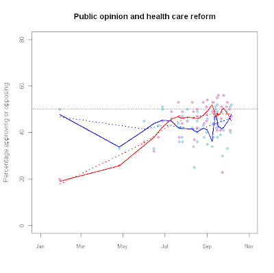
hc_app<-read.table("n:/misc/healthcareapproval.txt", header = T, sep = "\t")
attach(hc_app) hc_fit.o1<-lowess(Oppose~as.Date(Dates),f=0.25)
hc_fit.f1<-lowess(Favor~as.Date(Dates),f=0.25)
hc_fit.o2<-lowess(Oppose~as.Date(Dates),f=0.75)
hc_fit.f2<-lowess(Favor~as.Date(Dates),f=0.75)
plot(as.Date(Dates),Oppose,
main="Public opinion and health care reform",
ylim=c(0,80),pch=16,
xlim=c(as.Date("2009-01-01"),as.Date("2009-11-01")),
cex.axis=.85, col="#E6ADD8",
xlab="",ylab="Percentage approving or opposing") points(as.Date(Dates),
Favor,pch=16,col="#ADD8E6")
lines(hc_fit.f1,col="blue",lwd=2)
lines(hc_fit.o1,col="red",lwd=2)
lines(hc_fit.f2,col="blue",lwd=2,lty=3)
lines(hc_fit.o2,col="red",lwd=2,lty=3)
abline(h=50,lwd=.5,lty=3,col="#555555")
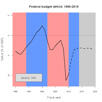
fy<-c(1990:2019)
deficit.1<-c(-3.9, -4.5, -4.7, -3.9, -2.9, -2.2, -1.4, -0.3, 0.8, 1.4, 2.4, 1.3, -1.5, -3.5, -3.6, -2.6, -1.9, -1.2, -3.2, -11.2, -9.6, NA,NA, NA, NA, NA, NA, NA, NA, NA)
projected<-c(NA, NA, NA, NA, NA, NA, NA, NA, NA, NA, NA, NA, NA, NA, NA, NA, NA, NA, NA, NA, -9.6, -6.1, -3.7, -3.2, -3.2, -3.1, -3.3, -3.2, -3.1, -3.4)
png("c:/data/deficit_color.png",height=480,width=480)
plot(deficit.1~fy,ylim=c(-12,5),type="n",lwd=2,col="red",
main="Federal budget deficit, 1990-2019",
cex.lab=1.1,cex.axis=.75,
xlab="Fiscal year",ylab="Deficit (% of GDP)")
rect(1988,-15,1994,6,col="#FF9999",border=NA)
rect(1994,-15,2002,6,col="#6699FF",border=NA)
rect(2002,-15,2010,6,col="#FF9999",border=NA)
rect(2010,-15,2014,6,col="#6699FF",border=NA)
rect(2014,-15,2021,6,col="#CCCCCC",border=NA)
abline(h=0,lwd=.5,lty=3,col="#555555")
lines(fy,deficit.1,lwd=2.5)
lines(fy,projected,lwd=2.5,lty=2)
rect(1990,-11.5,2000,-9.5,col="#dddddd",border="#555555")
text(1995,-10.5,"Source: CBO")
graphics.off()
It's pretty easy!
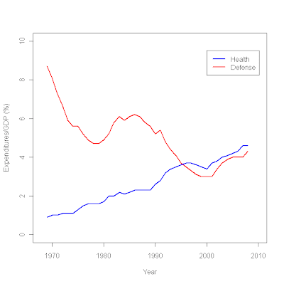
plot (c(1968,2010),c(0,10),type="n", # sets the x and y axes scales
xlab="Year",ylab="Expenditures/GDP (%)") # adds titles to the axes
lines(year,defense,col="red",lwd=2.5) # adds a line for defense expenditures
lines(year,health,col="blue",lwd=2.5) # adds a line for health expenditures
legend(2000,9.5, # places a legend at the appropriate place c("Health","Defense"), # puts text in the legend
lty=c(1,1), # gives the legend appropriate symbols (lines)
lwd=c(2.5,2.5),col=c("blue","red")) # gives the legend lines the correct color and width
miss <- read.table ("/data/missing.txt", header = T, sep = "\t")
attach miss result1 <- glm(a~b, family=binomial(logit))
summary(result1)
Call: glm(formula = a ~ b, family = binomial(logit))
Deviance Residuals:
Min 1Q Median 3Q Max
-1.8864 -1.2036 0.7397 0.9425 1.4385
Coefficients:
Estimate Std. Error z value Pr(>|z|)
(Intercept) -5.96130 1.40609 -4.240 2.24e-05 ***
b 0.10950 0.02404 4.555 5.24e-06 ***
---
Signif. codes: 0 ‘***’ 0.001 ‘**’ 0.01 ‘*’ 0.05 ‘.’ 0.1 ‘ ’ 1
(Dispersion parameter for binomial family taken to be 1)
Null deviance: 279.97 on 203 degrees of freedom
Residual deviance: 236.37 on 202 degrees of freedom
(3 observations deleted due to missingness)
AIC: 240.37
Number of Fisher Scoring iterations: 5
detach (miss)
attach (miss2)
result2 <- glm(a~b, family=binomial(logit)) summary(result2) Call: glm(formula = a ~ b, family = binomial(logit)) Deviance Residuals: Min 1Q Median 3Q Max -1.884 -1.198 0.742 0.936 1.446 Coefficients: Estimate Std. Error z value Pr(>|z|)
(Intercept) -6.0059 1.4162 -4.241 2.23e-05 ***
b 0.1101 0.0242 4.549 5.39e-06 ***
---
Signif. codes: 0 ‘***’ 0.001 ‘**’ 0.01 ‘*’ 0.05 ‘.’ 0.1 ‘ ’ 1
(Dispersion parameter for binomial family taken to be 1)
Null deviance: 278.81 on 202 degrees of freedom
Residual deviance: 235.14 on 201 degrees of freedom
AIC: 239.14
Number of Fisher Scoring iterations: 5
plot(b, fitted(result1))
plot(b, fitted(result1), type="n")
curve(invlogit (coef(result1)[1]+coef(result1)[2]*x), add=TRUE)


